I for one dont see a problume with the red it is a little darker that the red here.
-
TDR Magazine subscribers receive more than the magazine! You also gain additional forum privileges!
Details here: TDR Privileges
Subscribe to TDR Magazine here: https://www.tdr-online.com/
You are using an out of date browser. It may not display this or other websites correctly.
You should upgrade or use an alternative browser.
You should upgrade or use an alternative browser.
New forum software - need your help testing & input
- Thread starter Steve St.Laurent
- Start Date
 Attention: TDR Forum Junkies
 To the point: Click this link and check out the Front Page News story(ies) where we are tracking the introduction of the 2025 Ram HD trucks.
Thanks, TDR Staff
Steve St.Laurent
Staff Alumni
For those that don't like the red scroll to the bottom of the page where there is a pull down menu that says "TDR Roundtable vB3 Style" and change that to "Grey - TDR Roundtable vB3 Style" and tell me how you like that one. You can change it permanently by pulling down the "Discussion Forums" menu to "User Control Panel" and then clicking on "Edit Options" - down near the bottom is a spot where you can choose your forum skin. We can give people both options.
Originally posted by Steve St. Laurent
That depends on which list you were on. If you were doing a search then you need to either hit the back button twice or hit the down arrow next to your back button and click on the 2nd link - just like now. If you were in a forum then you can do the same (click on back) or you can click on the forum name in the nav bar and it will take you back there.
i usually look a posts since i last visited and when i do a quick reply to a thread and hit back button twice i am always returned to my post as it everone sees it in forum, but scrolling down 2 places does work correctly (as you stated) taking me back to the thread list i was in -- thank you for your help (no further help on this - you got your plate full)
Last edited:
Steve sorry I didnt say this before but thank you for all the work you guys have put into this.
Steve, the problem is only with the new forum. Everything works fine with the old one and there is no sizing issues. Like I said above, I don't know what a lot of this stuff is. I tried to go to the control panel like you said but didn't see how to "display" and get to the settings. Didn't see anything that showed text size. I assume you mean the control panel for TDR and not the one in my computer.
I had similar problems the last time you changed the forum setup and it took awhile to get straightened out. The colors last time was a problem for me and the red will be this time as well. When there are small black letters in the red field, they sorta blend together and it is tough to read. I changed mine to the nuetral color set up you are talking about and it was much better. As long as that is an option on the new forum it will be ok.
stan
Steve St.Laurent
Staff Alumni
Try it now paccool - the forumjump box had all of the FAQ forums in it and also the (Members Only) text which made that part of the screen too wide. I've removed that text and it should now fit fine on an 800x600 screen - which is the minimum most people are running now. Let me know if that fixed it for you.
I did find another problem with widths and that is when there is a large picture - the whole screen is then sized for that picture. Working on that now.
Keep em rolling in guys.
I did find another problem with widths and that is when there is a large picture - the whole screen is then sized for that picture. Working on that now.
Keep em rolling in guys.
Last edited:
")
Hi Steve - Lotsa work - great job. When I first saw the red I thought Holy Moly, but then I changed the style to grey. I"ll take the red for sure. The grey looks like B&W TV. My 1st choice is usually blue but I"ve associated the TDR site with red for years, so red is fine. When do you sleep?
Steve, I didn't catch this before I left home this morning. But I did notice you had the system down last night for a time.
My monitor here at work is digital and the company hasn't provided the correct digital driver card yet. The analog video just smears around. The red color is smearing all over everywhere. I would really prefer that you loose all that red color. I am pastel color blind and can't read thru that stuff. Make it some kind of soft blue/green color maybe.
Hot colors jump out at you and cause eye strain.
I like the new software and was aware you were going to have to do something pretty soon. Other forums jumped in too quick I think and didn't polish things up and use "test mode" as you are doing. I commend you on your dedication to running a "perfect" forum infrastructure. I have been there and done that. It is usually a thankless task that maybe occassionally draws a postive comment or two.
Get some sleep and tackle it again after your eyes normalize and quit looking like last week's hang-over")
John
ps, when I get home, will take another look on a good monitor and fast DSL access. Right now, company network is slower than molasses in January.
My monitor here at work is digital and the company hasn't provided the correct digital driver card yet. The analog video just smears around. The red color is smearing all over everywhere. I would really prefer that you loose all that red color. I am pastel color blind and can't read thru that stuff. Make it some kind of soft blue/green color maybe.
Hot colors jump out at you and cause eye strain.
I like the new software and was aware you were going to have to do something pretty soon. Other forums jumped in too quick I think and didn't polish things up and use "test mode" as you are doing. I commend you on your dedication to running a "perfect" forum infrastructure. I have been there and done that. It is usually a thankless task that maybe occassionally draws a postive comment or two.
Get some sleep and tackle it again after your eyes normalize and quit looking like last week's hang-over
John
ps, when I get home, will take another look on a good monitor and fast DSL access. Right now, company network is slower than molasses in January.
error on reply
I tried to reply to a thread and got this error -
[q]
Parse error: parse error, unexpected $ in /www/testme/htdocs/forums/includes/functions_bbcodeparse.php on line 149
Fatal error: Call to undefined function: parse_bbcode() in /www/testme/htdocs/forums/includes/functions_newpost.php on line 838
[/q]
Is that bad? Oh man, I can hear my Mom now - "Look but don't touch!"
Thanks, Steve for all your hard work, this forum is the best!
Neil
Steve St.Laurent
Staff Alumni
I'm working on that section of code right now boondocker - that was an error I had put into it. I'm trying to automatically resize pics that are too large because they screw up the formatting of everything. I have it working on vB codes but not yet on html codes.
Originally posted by Steve St. Laurent
For those that don't like the red scroll to the bottom of the page where there is a pull down menu that says "TDR Roundtable vB3 Style" and change that to "Grey - TDR Roundtable vB3 Style" and tell me how you like that one. You can change it permanently by pulling down the "Discussion Forums" menu to "User Control Panel" and then clicking on "Edit Options" - down near the bottom is a spot where you can choose your forum skin. We can give people both options.
How about a little darker grey, not to complain too much, but it with the grey setting, it seems to be all one color.
Or how about a drop down box with a wide variety of colors to choose from, depending on you mood
 .
. Brian
TOO MUCH RED BORDER. CURRENT VIEW IS MUCH BETTER. BOEDER ALSO EATS UP TOO MUCH SPACE.Originally posted by Steve St. Laurent
I've hinted at this over the last few weeks and the time has arrived - we are moving to V3 of vBulletin. We are on V2. 2 right now and there are a lot of cool features in the new software that we think you'll enjoy. The software has been out in production long enough now and looks to be stable.
I've been working overtime (a bunch of LONG sleepless nights) getting it ready for our use. I had made a number of modifications to vB for our specific use over the years and many of those mods had to be completely rewritten to work with the new software. The moderators and staff have tested it and the only issue I'm aware of right now is Opera renders the pull down menu's incorrectly - I am looking into that. Right now there is no spell check - I will add that after it's been up and running in production for a while to be sure that the spell check isn't causing problems.
I need you guys/gals to take a look at the new software - go ahead and try to break it
Keep in mind that the software is running on this same server with the regular software right now - so it's doing double duty. I did this to make sure to work it out. Also, there is a cache that will take a week or two for it to be fully functioning - so things will speed up once it's in production after a week or so.
Enjoy the new software and I'll be anxiously awaiting your thoughts. Please post any questions, concerns, problems, suggestions, etc here and NOT on the new site. Also, keep in mind that ANYTHING that you do on the new site WILL be deleted when I put it into production - everything done over there is just a test.
<center><a href="http://www.dieselregistry.com/forums"><font size="6"><b>CLICK HERE FOR THE TEST FORUM<b></font></a></center>
-Steve St. Laurent
Webmaster

TOO MUCH RED! CURRENT VIEW MUCH BETTER. ALSO BORDER EATS UP TOO MUCH SPACE.
New Look
I prefer the look we have now with the columns alternating grey and white. That helps seperate different information catagories.
The blue lettering on a grey backround you use now is easier on the eyes.
It looks like you are trying a smaller font. I prefer the size you have been using.
A colored backround helps separate different post but I am not crazy about red. I wish I could see different colors such as light and medium blue. Maybe we could have choices.
Good job on the new format.
Re: New Look
I quadruple second all of the color comments regarding eye strain! The alternating backgrounds and cooler colors of the current site are much better. I didn't make it through a full thread without having to walk away and I spend more time on here than any human should!
Thanks for all the hard work and keeping us diesel bums up to date. Truly can't thank you enough...
-Richard
Originally posted by sfr1047
I prefer the look we have now with the columns alternating grey and white. That helps seperate different information catagories.
The blue lettering on a grey backround you use now is easier on the eyes.
It looks like you are trying a smaller font. I prefer the size you have been using.
A colored backround helps separate different post but I am not crazy about red. I wish I could see different colors such as light and medium blue. Maybe we could have choices.
Good job on the new format.
I quadruple second all of the color comments regarding eye strain! The alternating backgrounds and cooler colors of the current site are much better. I didn't make it through a full thread without having to walk away and I spend more time on here than any human should!
Thanks for all the hard work and keeping us diesel bums up to date. Truly can't thank you enough...
-Richard
Steve St.Laurent
Staff Alumni
Originally posted by guava
It feels like the pull down menus are a little disorganized. I've been having to go through several before finding the choice I want.
Could you be more specific? Are you talking about the menus at the top or the menus down in the forums like thread tools, etc. What were you trying to find that you had a hard time finding? Basically you can get to everything that you could on the old site on the one string of buttons at the top. Everything related to the forums is under the discussion forums button and all the other website features (chat, tsb's, travel companion, etc) are under the website features.
Originally posted by Murle
If it ain't broke don't fix it.
Problem is that it is broke - I'll let you know the details of why after the new version goes live. Plus once you get familiar with some of the new features I think you'll be really happy with it. The users on all the other sites I've visited that converted over to the new version have been very happy.
Originally posted by lklauder
I did not see a button for getting a printable version (e. g. , not so much red)
Printable version of a thread is under the thread tools menu when you are viewing a thread. Or as I said above you can change the skin by changing the option down at the bottom of the screen or in your control panel.

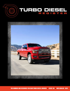
Issue 128 – Digital Version
Digital Magazines
FREE!
TDR Test Drive - Digital Edition
Renew
Subscribe
Gift Subscriptions

Back Issues
Subscription Status
Address Change Form
Buyer's Guides
Ram Diagnostic Trouble Codes
The Perfect Collection
The Perfect Collection Vol. II
TSB Updates
Dodge/Cummins Historical Overview
Cameron Collection
What Makes Us Tick?
Product Showcase
Advertising


Turbo Diesel Register
Issue 128 – Digital Version
Digital Magazines
FREE!
TDR Test Drive - Digital Edition
Renew
Subscribe
Gift Subscriptions

Back Issues
Subscription Status
Address Change Form
Buyer's Guides
Ram Diagnostic Trouble Codes
The Perfect Collection
The Perfect Collection Vol. II
TSB Updates
Dodge/Cummins Historical Overview
Cameron Collection
What Makes Us Tick?
Product Showcase
Advertising